| Sponsored Ads |
|
|
If this is your first visit, be sure to check out the FAQ by clicking the link above.
You may have to register before you can post: click the register link above to proceed.
To start viewing messages, select the forum that you want to visit from the selection below.
<<<<<< Register to remove these ads >>>>>>
|
|
 01-19-2011, 11:43 PM
|
#1
|
|
Viper Member
Join Date: Aug 2010
Age: 41
Posts: 3,962
|
I think the logo/banner needs to be bigger and centered, and the "South East Mopars" font in it needs to be the font of our logo
I also think the Logo on the bottom of the page needs to be hyperlinked back to the homepage
Overall i give is a HUGE A+. I love it. Im glad it ended up with this color scheme....I hated some of the others...lol
|
|
|

|

|
|
01-19-2011, 11:58 PM
|
#2
|
|
Super Moderator
Join Date: Oct 2010
Age: 47
Posts: 6,570
|
Originally Posted by RamStrat

I think the logo/banner needs to be bigger and centered, and the "South East Mopars" font in it needs to be the font of our logo
I also think the Logo on the bottom of the page needs to be hyperlinked back to the homepage
Overall i give is a HUGE A+. I love it. Im glad it ended up with this color scheme....I hated some of the others...lol
|
I can agree with that
|
|
|
|
|
|
|
01-20-2011, 01:30 AM
|
#3
|
|
Vertically Challenged Super Mod
Join Date: Oct 2010
Location: Collinsville, OK
Name: Michael
Age: 46
Posts: 2,700
|
on my screen in the top right where the members area is, the top banner is off to the left about an inch. also this layout is about an inch bigger than rf which i only noticed because i had to scroll over to hit the login button. i dont know if those two things are related just something i noticed
|
|
|
|
|
|
01-20-2011, 02:46 AM
|
#4
|
|
Administrator
Join Date: Aug 2010
Age: 50
Posts: 248
|
Originally Posted by OklaHemi
on my screen in the top right where the members area is, the top banner is off to the left about an inch. also this layout is about an inch bigger than rf which i only noticed because i had to scroll over to hit the login button. i dont know if those two things are related just something i noticed
|
Can you take a screen shot and post it up here.
|
|
|
|
|
|
01-20-2011, 01:35 AM
|
#5
|
|
Newb
Join Date: Jan 2011
Age: 45
Posts: 23
|
this is a new skin? What did it look like before???
I like this one. The colors blend well and its really sharp looking!
|
|
|
|
|
|
01-20-2011, 03:48 AM
|
#6
|
|
Super Moderator
Join Date: Oct 2010
Age: 47
Posts: 6,570
|
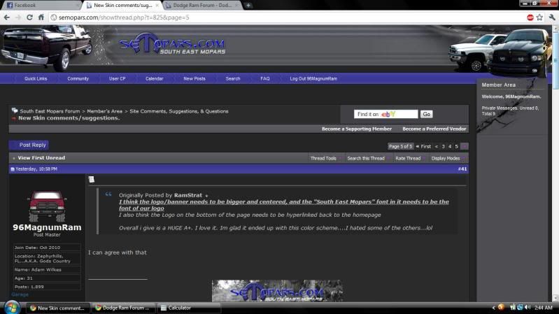
hmmmm weird, on my screen it looks to be alright:
|
|
|
|
|
|
|
01-20-2011, 11:39 PM
|
#7
|
|
Administrator
Join Date: Aug 2010
Age: 50
Posts: 248
|
Originally Posted by 96MagnumRam
hmmmm weird, on my screen it looks to be alright:
|
Not sure what you mean about the header being off? I don't see anything off on your screen shot?
|
|
|
|
|
|
01-20-2011, 03:49 AM
|
#8
|
|
Viper Member
Join Date: Aug 2010
Age: 41
Posts: 3,962
|
My screen is perfect
|
|
Last edited by Onk; 01-20-2011 at 04:00 AM.
|
|
|
|
|
01-20-2011, 03:54 AM
|
#9
|
|
Super Moderator
Join Date: Oct 2010
Age: 47
Posts: 6,570
|
Kevin...you need AdBlock Plus for your Chrome browser...
|
|
|
|
|
|
|
01-20-2011, 07:20 AM
|
#10
|
|
President - Admin
Join Date: Aug 2010
Location: Tampa Bay
Name: Jay
Age: 46
Posts: 5,251
|
yeah the logo should be bigger up top, it does look dinky....i dont think the one at the bottom needs hyperlink because right above it it says south east mopars forum and thats a link, but the top one def....
|
__________________
'04 Murdered 1500 (His)
'12 Journey Storm (Hers)
|
|
|
|
| Thread Tools |
Search this Thread |
|
|
|
| Display Modes |
 Hybrid Mode Hybrid Mode
|
 Posting Rules
|
You may not post new threads
You may not post replies
You may not post attachments
You may not edit your posts
HTML code is Off
|
|
|
|








 "Ram It"
 TrueTone Ram
 Dani's Truck






 BLACKENED, or My Mistress